Logo design for W.E.T. W.E.T (Wet Earth Technologies) is a hydro vac dump truck site. Utilizing in water and solid separation. The goal was simple, straightforward and corporate.
This is a collection of some of my personaI art, I do this as my creative outlet. Creating from what interests and inspires me.
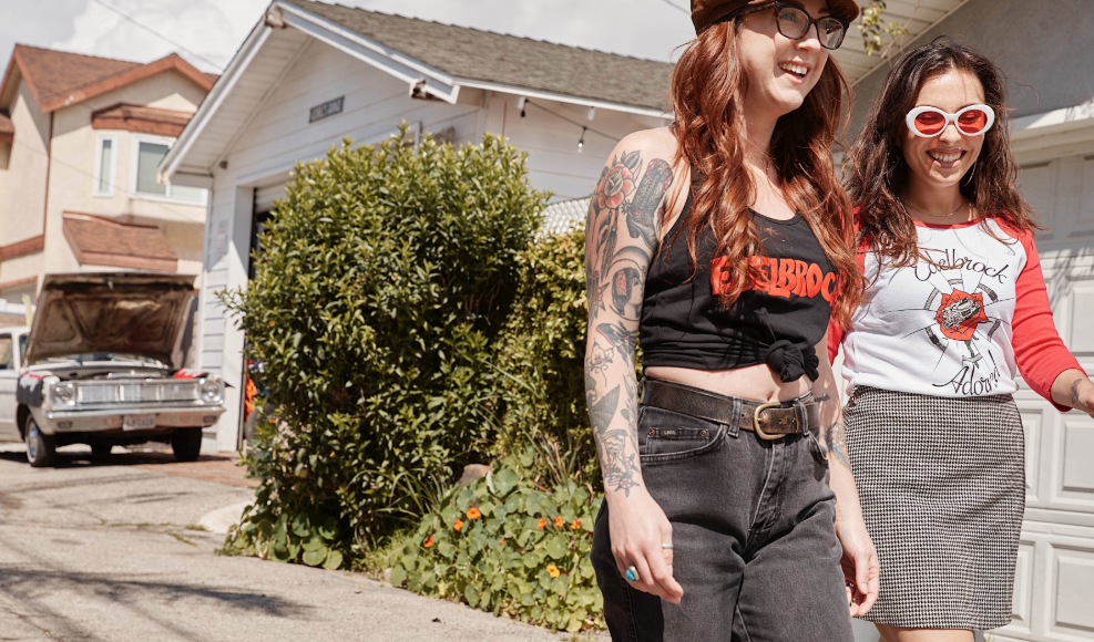
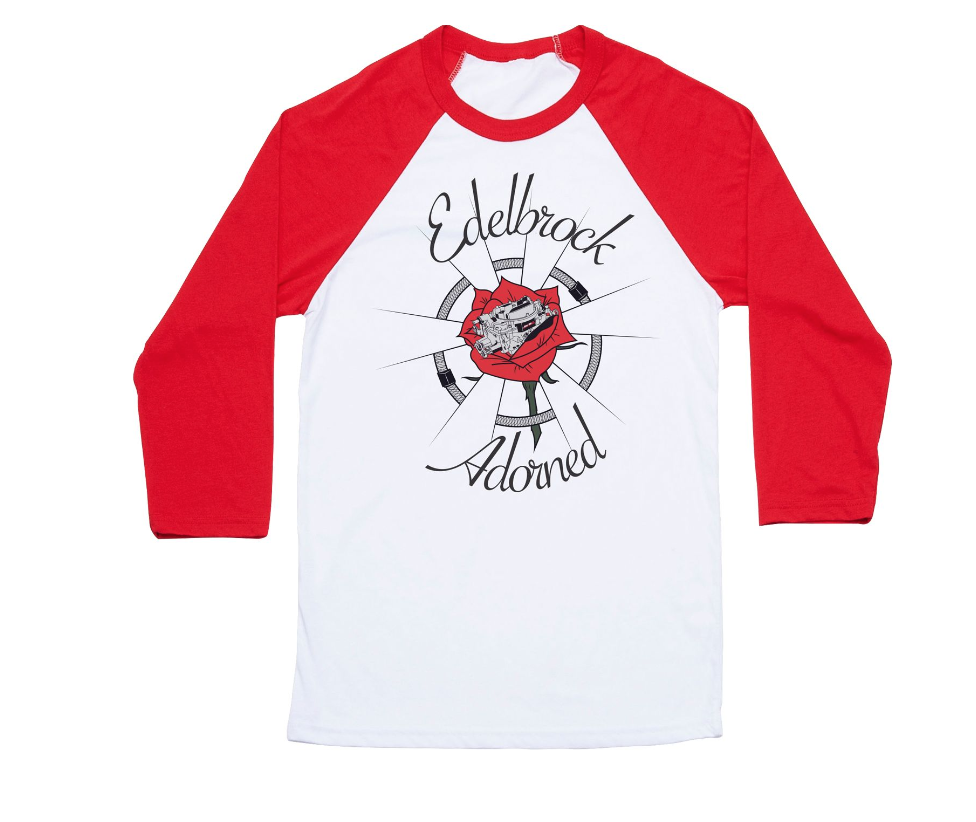
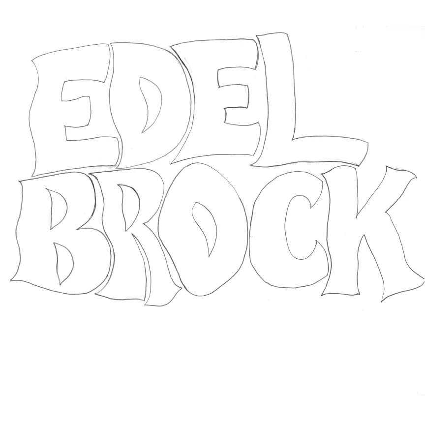
Edelbrock, LLC is one of the leading aftermarket automotive parts manufacturers in the country. Creating a new and updated apparel line was the main goal of this project. I wanted to capture the rich history of the brand and combine it with the vast car culture of today.
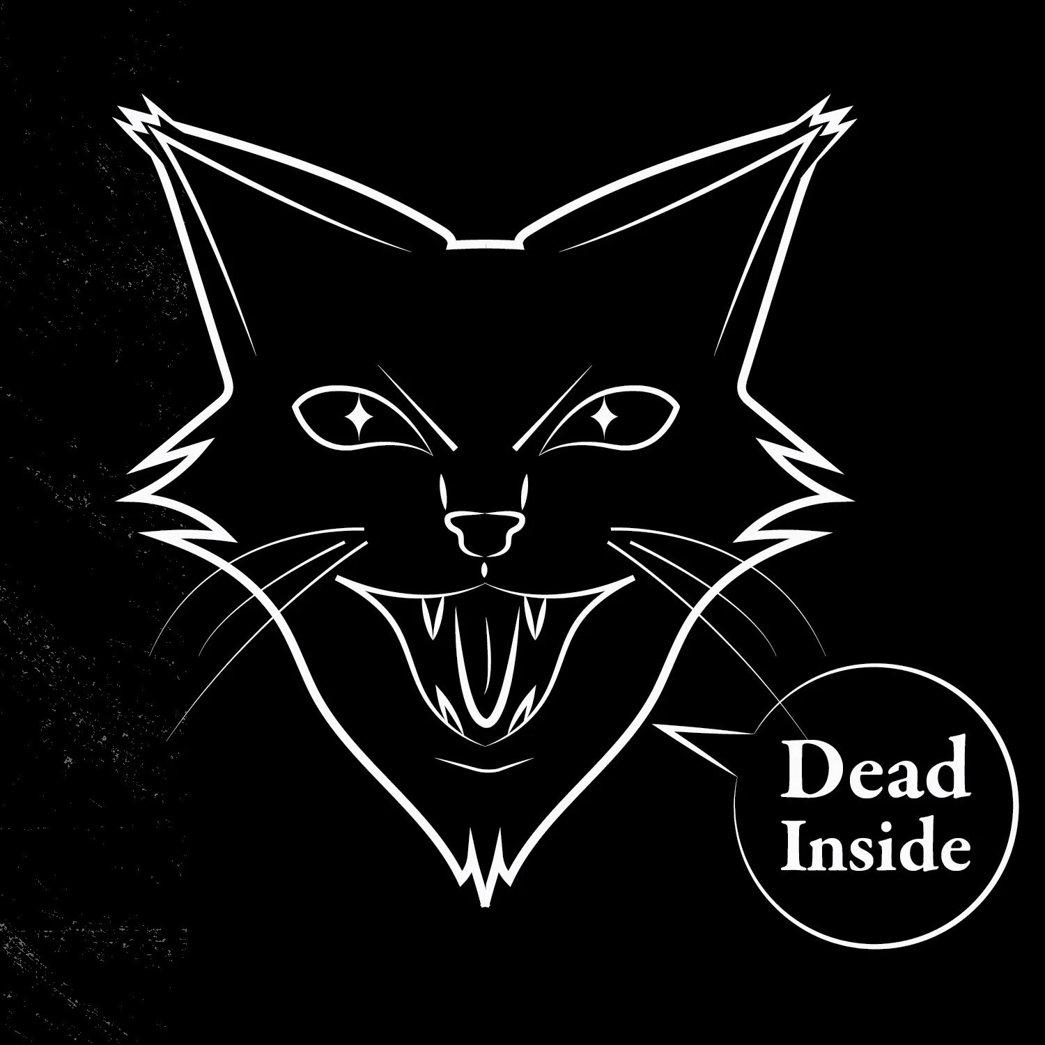
nine is a smart collar specifically for felines. Integrating IoT, AI, gps & video tracking into this collar we can get a closer look at how cats behave when we are not around. This collar will monitor your cats temperature, heart rate, and hydration levels. This product is for the cat omner who worries about their cats when working or away from home. This digital product will enhance the care for the cat(s) in your life, unlike the smart wearables out there for animals that are only for canines, this collar is specifically for those with nine lives.
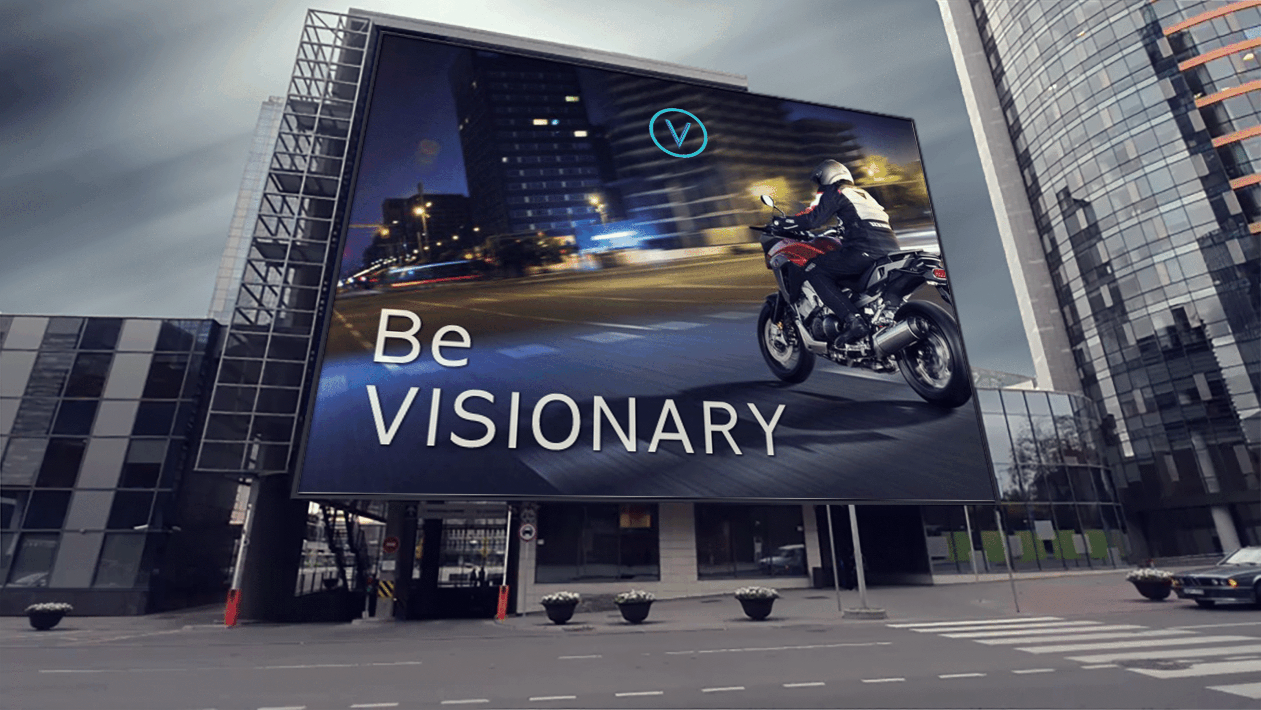
VISION™ helmets are a stylized and innovative solution for the motorcycle industry and rider. VISION™ equips the motorcyclist with technology that supports the pleasure of riding while ensuring they have critical information regaring road conditions, automotive hazards, data collection, speed, gps and interactive communication through a heads up display in the visor.
The VISION™ community of riders supports one another thrugh social platforms and data collection. VISION™ will forever change the motorcyclists experience throughout the world.
Various Homepage sliders for the New Edelbrock website, for different promotions and products.
All photography and edits are done by me.
BUBL is a personal project I created. BUBL is a brand of blowing bubbles that also act as aromatherapy. Targeted at anyone who suffers from anxiety, stress, depression or just needs a little break from their day. Simple and modern was how I designed the packaging. I did not want to take away from what the product is by over designing or making it childlike. This product is for adults and children alike, Don’t sweat the small stuff.
WICC was a personal project and was aimed at recreating the way boutiques showcase product. This storefront will be a self sustaining, all natural brand.Providing candles, incense, aroma therapy, candle accessories. The social responsibility of this store will be based on the garden that is behind the store. Using all of our plants to make our product. Based in Salem, MA. The design direction was to take modern twist on historic Apothecaries. It is an ode to Salem and its rich history of witchcraft, referencing its roots in the worship of nature. The goal is to lessen impact on earth and to teach people that they can make home remedies and be self sufficient.
Two flyers I created for RVCA IG. Both are images I edited, set type to RVCA branding specifications.
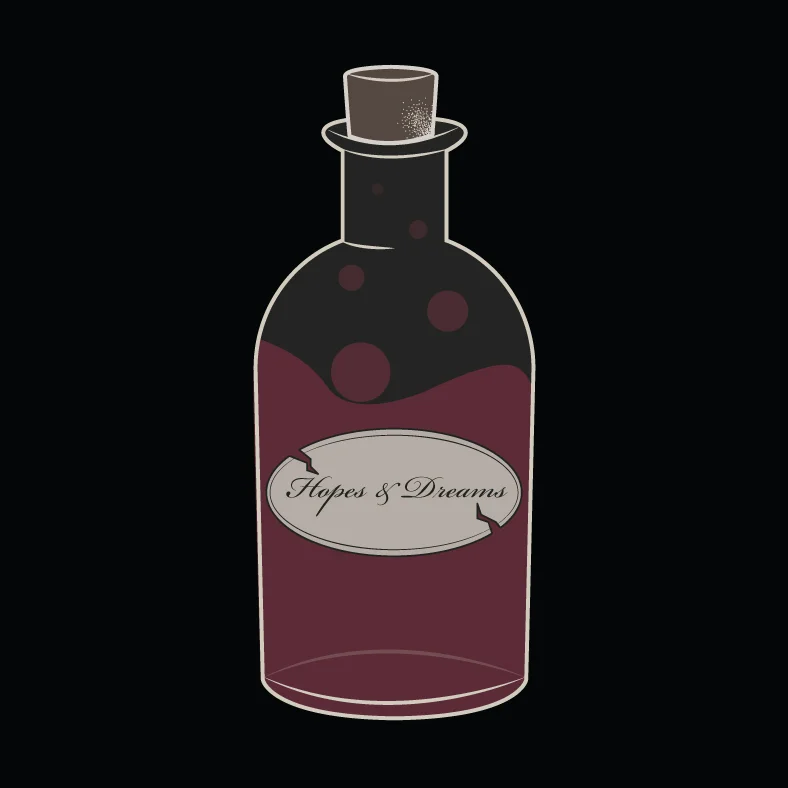
This was a personal branding project. I wanted to create a victorian inspired feel for the overall look of this brand. Taking from the intricate details from the victorian era. As well as producing interesting packaging that was reminiscent of antique glass bottles, I personally went out and found these bottles and created print logos and did all the photographing and edits.
Designing two separate hypothetical lines for surfing brand Hurley. This was a student project that was for Hurley. Salem & Tiki were the names of the lines. Salem was inspired by the salem witch trials during the 1600s. The design direction was a mysterious and dark feel that was meshed with the surf culture of California. Tiki was directly inspired by the tiki culture during the 40s-50s. Using bright vibrant colors in a vintage style, this line personifies the california surf culture.
Alchemy is a Tattoo Ink Brand that I created for a personal project. Alchemy is a brand that creates organic ink by using all organic minerals. The use of these minerals let us create a vast array of brilliant colors. The design direction I chose was a more historical and classic feel, which I feel will work for our demographics.
Web banners for different social media, email, and web banners. Created composition, set type, and placed logos in accordance to RVCA branding.
This personal project was inspired by the film Sweeney Todd : The Demon Barber of Fleet Street, which is directed by Tim Burton. One of the patterns created names Mrs. Lovett which is hand drawn and finished in Illustrator. The second is a digital created pattern named Sweeney. These patterns were then applied to clothing.
Industria Printer Ink is a personal project that sells printer ink that is sold in 100% recycled plastic cartridges. The design direction for this brand is proffessional yet approachable. Using a color palette inspired by nature and appropriate branding this ink is sure to make a positive impact.